Sign up FREE
and access up to 7 premium artworks!
- $0 forever
- upgrade anytime
Buy premium account
for unlimited access and artist support!
- access to all premium artworks
- all-in-one zip packs
- one time payment, does not renew
Buy merchandise with my artwork:
Vlad Gerasimov
15 February 2012
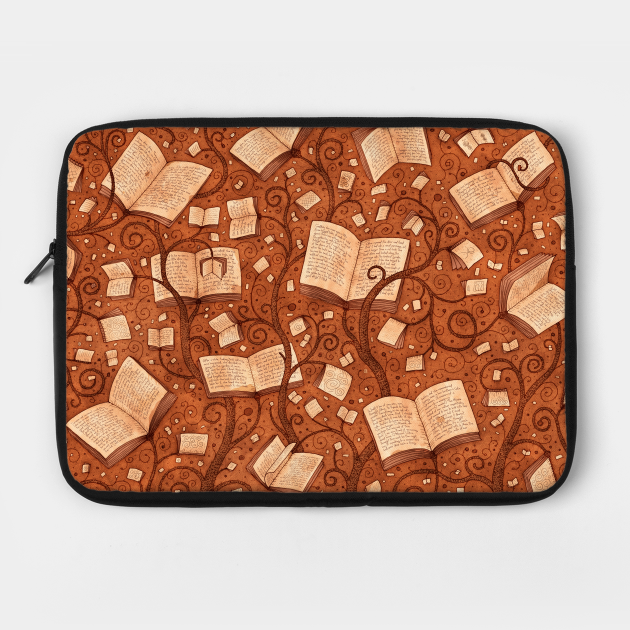
Allow me to start by saying I'm quite happy with this drawing, so if you are not for some reason, I beg your pardon :-) I'm usually not 100% satisfied with every new picture, and just get too tired to continuously improve it, so I just stop somewhere. This time however, I did enjoy the process till the end! And it took me several days to complete.
I wanted to try new technique, so I took a gel pen and A3 paper. After couple of days of relaxed drawing, I scanned the result and continued in Photoshop - added text layers, colors, effects, and some little details (which took another couple of days). I also made several color variations, because I am not sure which color combination is better, so I figured I'd publish all of them.
As you can see, this picture is very hard to use as desktop background - it is too busy with details, hard to see any icons above it. This is intentional. Usually I design my wallpapers with lots of empty space, to make them easy to use. This drawing was specifically designed for my highly successful collaboration with DecalGirl.com - they sell vinyl skins for laptops, phones and other devices. So I made this drawing with print in mind, not screen. You might even want to get a poster - I can assure you it will look impressive :-)
P.S. If you're curious, the text written on the pages is from Alice in Wonderland - no wonder, is it?
Niloo
15 February 2012
liked it dudee :D
George
15 February 2012
So NICE! One more time, congratulations!
Kawoosh
15 February 2012
Luckily i don't have any icons on my desktop, so perfect wallpaper (as usually), thanks, Vlad :-)
Marcel
16 February 2012
I definitely love the retro feel to it (not to mention the AiW text details - bonus!) This falls into my own favorite way of painting/drawing: symbolic, yet cheeky. From a pragmatic (wallpaper) POV though (and yes I know you already touched upon this) it is hard to use as a background, yet all I did was run it through Picnik's vignette effect (maximum strength/radius, color: crimson/black) and voila! I have a great contrast around the edges to see my icons, without sacrificing the integrity of your artwork. Sorry, I am a web designer after all :S
gail
16 February 2012
it's awesome! i can use it as a desktop background just fine because i only have few icons and stuff on my desktop. :)
glad i subscribed! :)
Jorge
17 February 2012
I love books and I love your wallpapers. Thank you! This has become my favourite one right away.
mimi
24 February 2012
really nice. I love u'r style of designs.thank u love;)
juria
4 March 2012
E' proprio quello che cercavo per concentrarmi sul molto studio che mi resta!
ben.skf
4 March 2012
very very nicee
erfrew
31 March 2012
ddddretre
erfrew
31 March 2012
ddddretre
human yang
27 July 2012
我喜欢!
finn
9 September 2012
Absolutely fine work!
Dorothee
14 December 2014
Love it. ιт мαкєѕ мє
NeonTree
23 September 2019
Simply stunning :)


